Saturday, January 30, 2010

Happy Saturday...

Quick and Easy Projects
By Lori Mancini

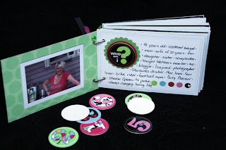
Hi everyone!! Today I have a quick post to share some projects with you. Feel like scrapping this weekend but don't have alot of time? This little mini album is quick, easy and fun to make!! You can whip one up in no time and record some information about yourself at the same time.

I used the 2 sets of Photo Cards and cut them up as my base for my pages. Printed out corresponding photo (with borders around them) and glued them to the back of the cards (love the Helmar tape adhesive for this - so strong!) I used my Cuttlebug to cut some circles and layered the Urban Lily Chipboard circles (Answer it).

Here is what it looks like and it was so easy to make:


I love the way it turned out for such a fast simple project!!

The next project I am sharing with you today is another quick and simple Valentines card or gift. This is a great way to tell that special person in your life that you care and can be customized anyway you want.

I used the Urban Lily Secret Keeper Windows - Heart Shaped and simply covered it with Lulu from the Lulliloo Collection. Make sure you cut the slit for the heart to open before adhering the back piece of paper on. Top it off with alpha letters as your sentiment and add a few embellishments to dress it up.

When you open it up you can slide a gift card in the heart! Just make sure that you leave some opening when glueing down the attern paper to the back.


Thanks so much for letting me share today! Have a great weekend!


Thursday, January 28, 2010

Minibook and Card

「Konnichiwa」from Japan! The mini book and card which I made are introduced today. I love making a mini book! Do you also like mini book creation?


Minibook[all about me]
Supplies:
Paper,chipboard,rubon – Urban Lily
Adhesives – Helmar Adhesives

It is using polo Blink Collection and Memory Photocards Polka Dot.


The cover wrapped and made the chipboard by the paper.


This mini book is a self-introduction book shown to a teacher and a friend, when she enters a new grade.

Card[forever always]
Supplies:
Paper, rubon – Urban Lily
Adhesives – Helmar Adhesives
This card is using Everyday Lily mainly. It is a paper of unique naming called Sushi dots. oh!SUSHI! I like sushi. . . LOL

The title and the flower have popped up.
Thank you for checking the Urabn Swank blog!
Akiko

Monday, January 25, 2010

bye bye 2009

Howdy! I'm Gaby from Mexico and I'm super excited to be able to share my first project for Urban Swank.

I'm still on the mood of the holiday season hehe so I used the photos we took the last day of 2009.


For my page I used 5 papers from Urban Lilly Yep 5!! I love layering and adding small pieces of paper also I love dimension so 3d dots are super useful to pop up some details (like the white/blue - green circles)

Urban Lily products used:
Papers: Everyday Lily (Sushi Dot) Mayella (Petite & Pure) Sugary (Breeze) and Swirl Memory Photo cards
Adhesive: Helmar

Thanks for stopping by!

Gaby


Sunday, January 24, 2010

Im so excited!!!

Hi everyone, its me Lori here and I can not tell you how excited I am to finally be sharing some of my work with Urban Swank! I remember way back when I first started scrapbooking, my very first "kit" I received was full of Urban Lily goodness... and that is when my love affair for these products started.

One of my favorite Urban Lily collections in amongst the many lines that I adore is definitely the Mooch Collection . I love the color combination, the graphic circle design, and the softness of the flower mottiff that are sprinkled all over. Of course the Sugarhigh paper is my ultimate favorite since it fits in so nicely with my love of circles and white backgrounds for scrapping!! A perfect match made in heaven.... here is my first layout to show you...


UR YOU
by Lori Mancini


Of course as soon as I saw this paper I immediately thought of my adorable nieces!! I used a photo taken on Christmas Eve of this year when she was putting on a little talent show for us...she was a little excited and a lot of silly!! Here personality is so unique that I tried to portray it in the layout and I did so by just a simple title...UR You... and that she definately is!!

This layout was actually very simple to create...you could most likely recreate it in less that 30 minutes...gotta love that!! I started by triming down a peice of white cardstock and adhering it to a coordinating colour blue cardstock. I distressed the edges of the white and then added my favourite technique of misting/spritzing the background!! You will quickly learn that I absolutely love building my layouts on a white cardstock base. I love how the colours of the pattern paper and my photo's just pop off of the page with a neutral background. Sometimes by adding just a little mist you still get the illusion of the white but its adds texture and visual interest - you must try it if you haven't!!

I continued on by cutting out all of circles in the Sugarhigh patterned paper and adhering it (with Helmars Adhesive) to my base. I then machine stitched all around the circles to again add texture to the layout - another must is all of my work. I matted my photo with white cardstock (again spritzed) and used a border punch for visual interest.

To complete this layout I used the Black and White alphabet with the Urban Cut Collection and cut out my title. I also love that I an add that extra white space around the letters to give the illusion of having them matted (which I usually do with all of my titles) - saves time, and looks better - PERFECT! I applied a glitter glaze to the letters and although hard to tell they have an overall shimmer with pinks and blue in them and are beautifull with the pattern paper. Again a great tip when working with an element that is maybe too harsh for your project - is applying a glitter glaze over them and that will soften them and dramatically change the appearance of whatever it is your working on. Sometimes what is in front of us to begin with can be altered and changed to fit in with our own unique style - and that is what I love about this hobby!

To add the finishing touches to my layout I pop dotted the title and used the butterfly from the secret keeper and covered it with the Apple paper from the Sugarhigh Collection... YUMMY!! I also need to add here that another thing I love so much about Urban Lily papers is how you can cross over collections and they all go so well together...Love that!

Adhering the butterfly and adding some more embellishments (ribbon, pins, bling) almost gave me the look I wanted but something for me was still missing. I needed a third strong element to offset the black title (I always work in groups of three...i know strange) so I did the old distress tear in the bottom corner for some added visual interest and balance and backed it with the a piece from Blackout. I added a bit more sewing and topped off the entire layout with some tiny punched butterflies using the Apple paper once again.

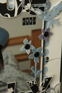
Here are a few closeups to show the dimension and details...


My second project to show you today is a quick a simple card.

HI
By Lori Mancini


To create this card I started with a black base of 12 x 6 folded for a 6 x 6 card. I used both the Swirl Memories Photo cards and the ATC cards as a color block background and added a strip of Apple pattern paper with the edges punched into a scallop and used some remaining paper and cut out the leaf pattern to add to my flower later on.

I used a generic sentiment of "hi" cause I like to have "generic" cards around for that last minute party or invite - and used the alphabet letters again onto the card.

A little sewing, one tiny flower and a little dazzle with a rhinestone flower center and another punched butterfly gives this card simple sophistication.

I hope you enjoyed my projects today and I look forward to seeing you next week when I will have more Urban Lily goodness to share. Have a great week everyone!

Saturday, January 23, 2010

Rachel's Anniversary Card and Summer Page

My favorite paper is this green paper with beautiful flowers on it. Having boys, I don't get to use flowers very often so green flowers were perfect for me! The photos in the page below were taken at Big Spring, Missouri. This spring is the biggest in the world. The water is crystal clear, brilliant blue, and gushing out of the ground. It was a beautiful match for the beautiful Urban Lily papers.

To make this page I used Massimo Cardstock, Mooch Collection Raw, and Sugary Collection Apple. I've sprayed the Raw paper with Glimmer Mist and backed the page with cardstock. Additional flowers are Prima flowers. The Massimo Cardstock was cut on my Silhouette and it cut perfectly.


My 7th anniversary was on January 11. To make my husband this card, I used Posh Cardstock Photo Cards and layered Mooch Collection Spark over the top by cutting out the rectangle with the heart on it. The bow is made out of the polka dot paper for the Urban Lily mini-book covers. It's a sturdy cardstock and made a really great bow. We had a lovely day and my husband really loved the card.

Hope you all have a great weekend with your families and friends! Enjoy each other!
Rachel

Friday, January 22, 2010

Mooch & Secret keeper Chipboard

Hello everyone! The charge of today's Urban Swank Blog is me. I'm Akiko and Japanese Scrapper! Please see my work!!


Supplies:
Paper,ATC cards,rubon,lettering – Urban Lily
Adhesives – Helmar Adhesives

First, it is a 12-inch layout. These are using Mooch Collection. It made Sugarhigh mainly. The stitch is written by hand inside the circle design.


The title is using ATC Cards and the alphabet.


I did the cutout of the spark and piled up on Sugerhigh. The butterfly pasted only the part and feather is floated.

I made the door plate using Secret Keeper Chipboard.


Supplies:
Paper, Secret keeper Chipboard,ATC cards,rubon – Urban Lily
Adhesives – Helmar Adhesives


opened, "please knock"


It is the back side.


If it opens, it can see the character of "Come in."

The goods of wonderful Urban lily can give us an inspiration, and can make a pleasant and interesting work. Please make a great work during this weekend.

Have a good weekend!

Akiko

Thursday, January 21, 2010

What Makes Me Laugh???

Urban Lily products make me laugh uncontrollably with happiness! How about you??? When I asked my youngest daughter what makes her laugh, she said, "Oh Mommy, slides of course!" and guess what? I found the perfect pictures to match her answer! Here is my layout...


Supplies: Urban Lily (pattern paper, alphas, chipboard circles); Making Memories (Tiny Alphas), Glitz Designs (large gems); Heidi Swapp (small gems); cardstock (unknown)

Here is a close-up of chipboard circle. I love the vivid colours and phrases on the circles. They are meant to shine and take centre stage...at least that is how I feel! :-)


Here is an aerial view of the raised alphas for the title.


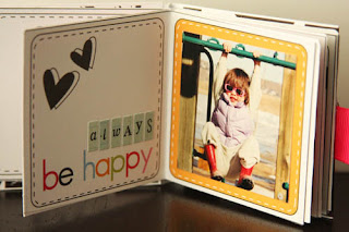
Now let's talk minis for a minute...I absolutely adore these mini album sheets from Urban Lily. Gosh, they are beautiful and can be completed lickety split. Mine is depicted below and each of my daughters will be writing a special note for each other on the pages.


Thanks for letting me share!

Tuesday, January 19, 2010

Layering Urban Lily

Hello scrappers, I am Aida. How has your week been so far ?

Today the buzz words in scrapbooking are *texturing and layering*. Whenever you walk down scrapbook aisles you will see many embellishments in felt, softies or chipboards that it's become almost impossible to choose. So where does that leave Urban Lily ? This brand's strongest pluses are clean, popping gaphics of the paper designs, it's what we love. Keeping this in mind, I would like to show you how to pair Urban Lily with craft products like glitter cardstock and thin foam sheets to give textured layers to your projects.

For this mini-book project I used the chipboard Secret Keepers with the beautiful butterfly and flower shape. The chipboard pages were trimmed to create a layered mini book with pages in odd sizes to make it interesting. Next I traced the butterfly and flower onto glitter cardstock and cut the shapes out.


The butterfly and flower were matted to give it that extra definition as you can see below. Urban Cut words were used for the title of the album and I do LOVE my buttons !!!


Throughout the book I used hand trimmed bracket shapes of different sizes for accents.


More details :


In this layout, the pale blue of the flowers were accented with thin black foam. The Photo Card swirls were partially cut out and the photo inserted.


Details :


Urban Lily products used :
Papers : Everyday Lily (Sushi, Sushi Dot, Linen Stripe)
Secret Keeper Cardstock Layers
Urban Cut Mini Book Colour
Photo Cards Swirl

Thanks for stopping by !!

*Aida*

Monday, January 18, 2010

"What You May Not Know?"

Hello Everyone! It's Virginia here - I am so excited to share my project with you today! So in answer to my question, "What you may not know???" is how easy it is to make quick and easy and beautiful projects with Urban Lily products. I would like to share two of my projects with you.

Here is an adorable mini album I made in 30 minutes or less. It took me longer to wait for the glue to dry than to put the album together! hee hee

Wanna learn how to make this little gem?

Using Mini Book Bright, I cut out each of the 5 pages and the cover. The pages were scored and adhered back to back. (See image below.)

Before attaching the cover, this is what the scored cover looks like. I cut a slit in the 1st and 4th panel so that I could thread ribbon through to tie the book closed. (The image is turned backwards to clearly show the ribbon threading.)

To secure the pages in the cover, I cut a piece of paper, approximately 2.5"x1" and scored at 3/8" and 5/8" to create a "valley" 0.25" wide.

This "book binding" was glued to the pages with the Helmar 450 Quick Dry Adhesive.

Once the glue is thoroughly dry, glue the book contents to the book cover.

Voila! You have a gorgeous mini album in minutes! Below are the pages from the mini album. I promised my girls that they can write their names in the album.


I love Urban Lily products ALOT!!!! Here is a layout I did of my youngest daughter using Polo (from the Blink Collection) and Ink (also from the Blink Collection). I added gems from Glitz Design and a whole lotta pop dots! LOL The title was created using the letters from the Alphabet paper plus a few letters from Making Memories tiny alphas.

Here is a couple close-ups...


Thank you for letting me share my projects!
-Virginia